Overview
A fresh, unified brand identity for Frasers Group's Visual Merchandising Standards programme — bringing consistent visual language to all VM communications across Sports Direct stores.
Frasers Group commissioned a standalone brand identity for their Visual Merchandising Standards programme — a dedicated visual system to unify and elevate VM communication across Sports Direct stores. The scope covered a comprehensive graphic toolkit: identity guidelines, branded documentation templates, and animated content, all designed to set a new standard for how VM is communicated throughout the business.
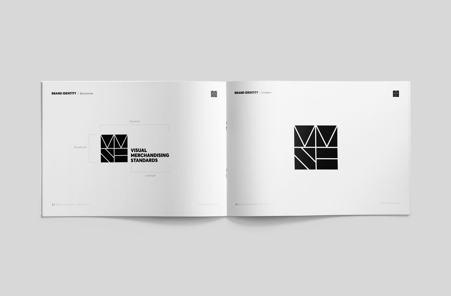
A Dedicated Identity
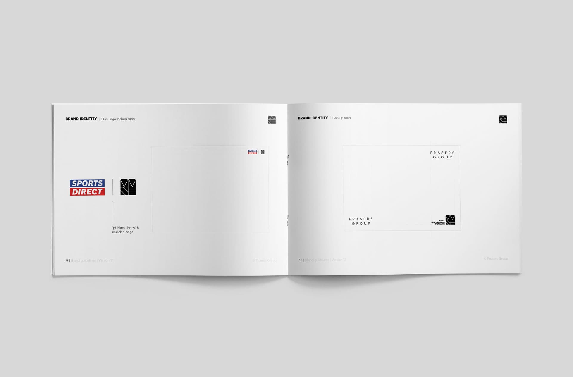
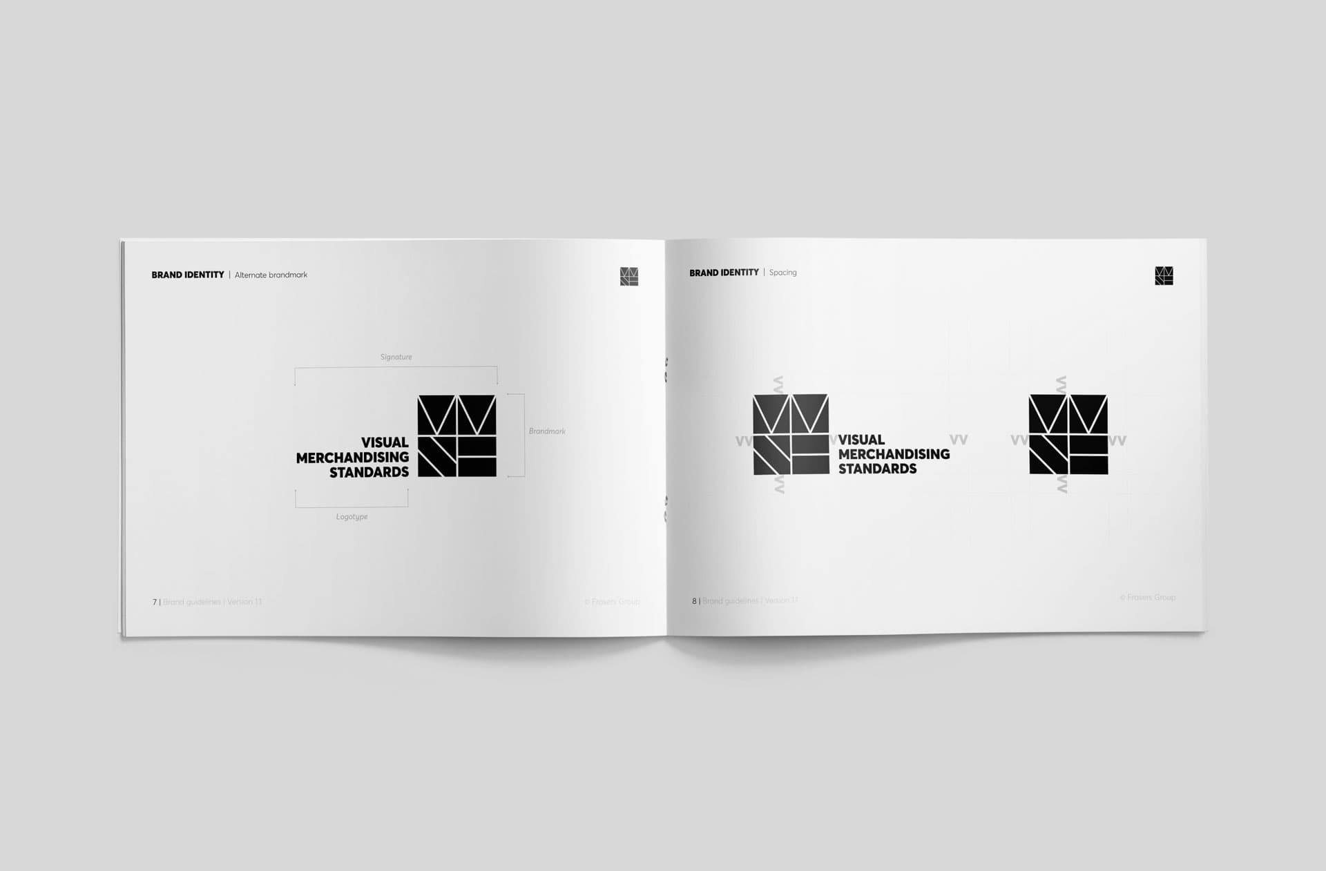
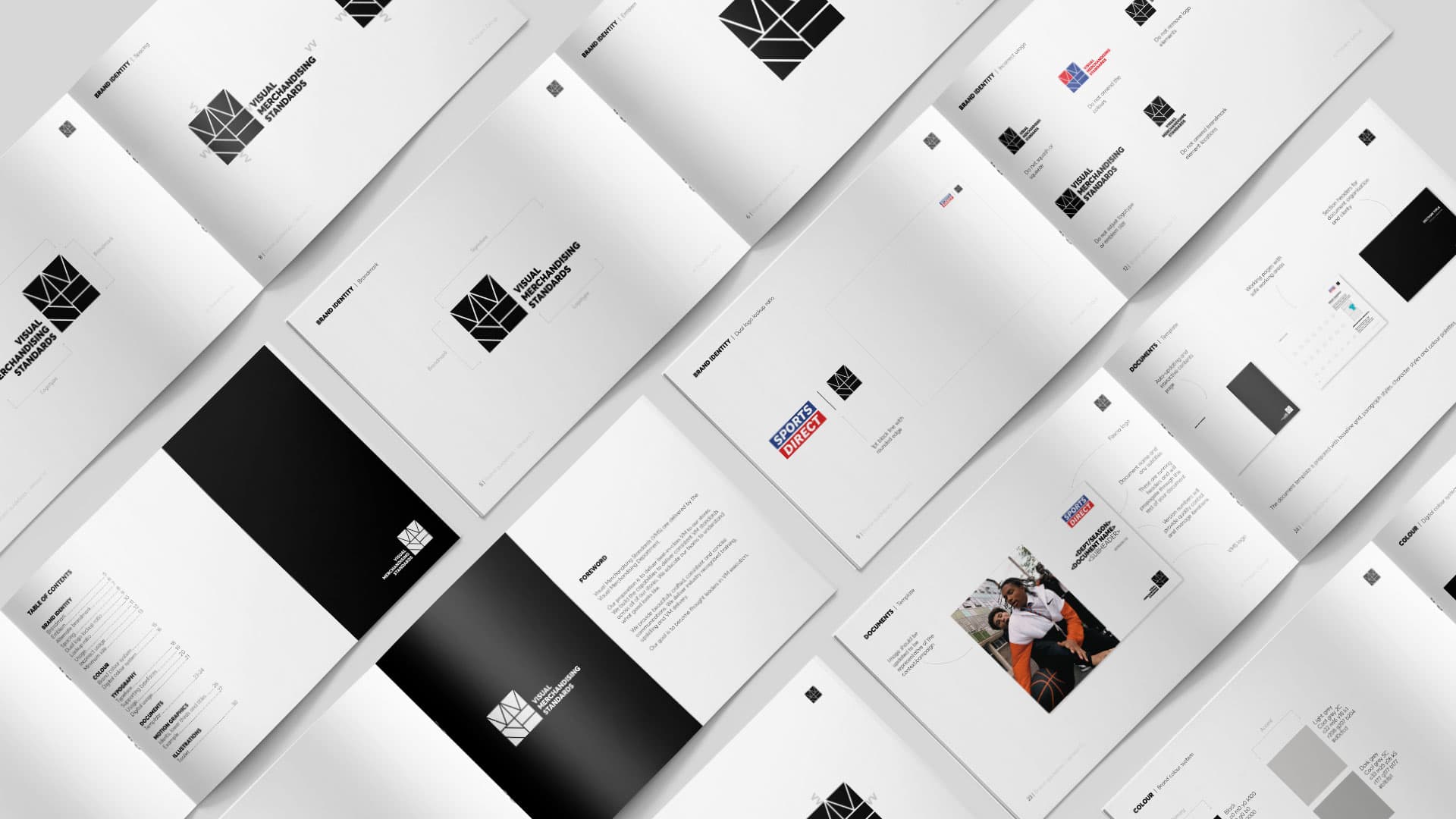
At the core of the system is a geometric brandmark built to communicate the structure and authority of Visual Merchandising Standards. Defined across the guidelines are its construction, spacing, and lockup rules alongside the Sports Direct and Frasers Group co-branding relationships — ensuring the VMS identity sits confidently within the wider Frasers Group ecosystem.
Brand System
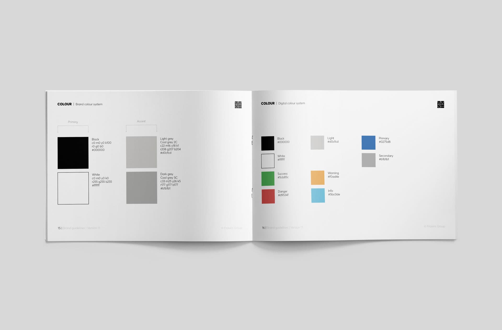
The VMS colour palette centres on black, white and cool greys — clean, authoritative and adaptable for both print and digital output. A secondary digital system introduces status and UI colours for application interfaces. Paired with geometric typography, the system provides a consistent, professional backbone across all VM communications.
Document Templates
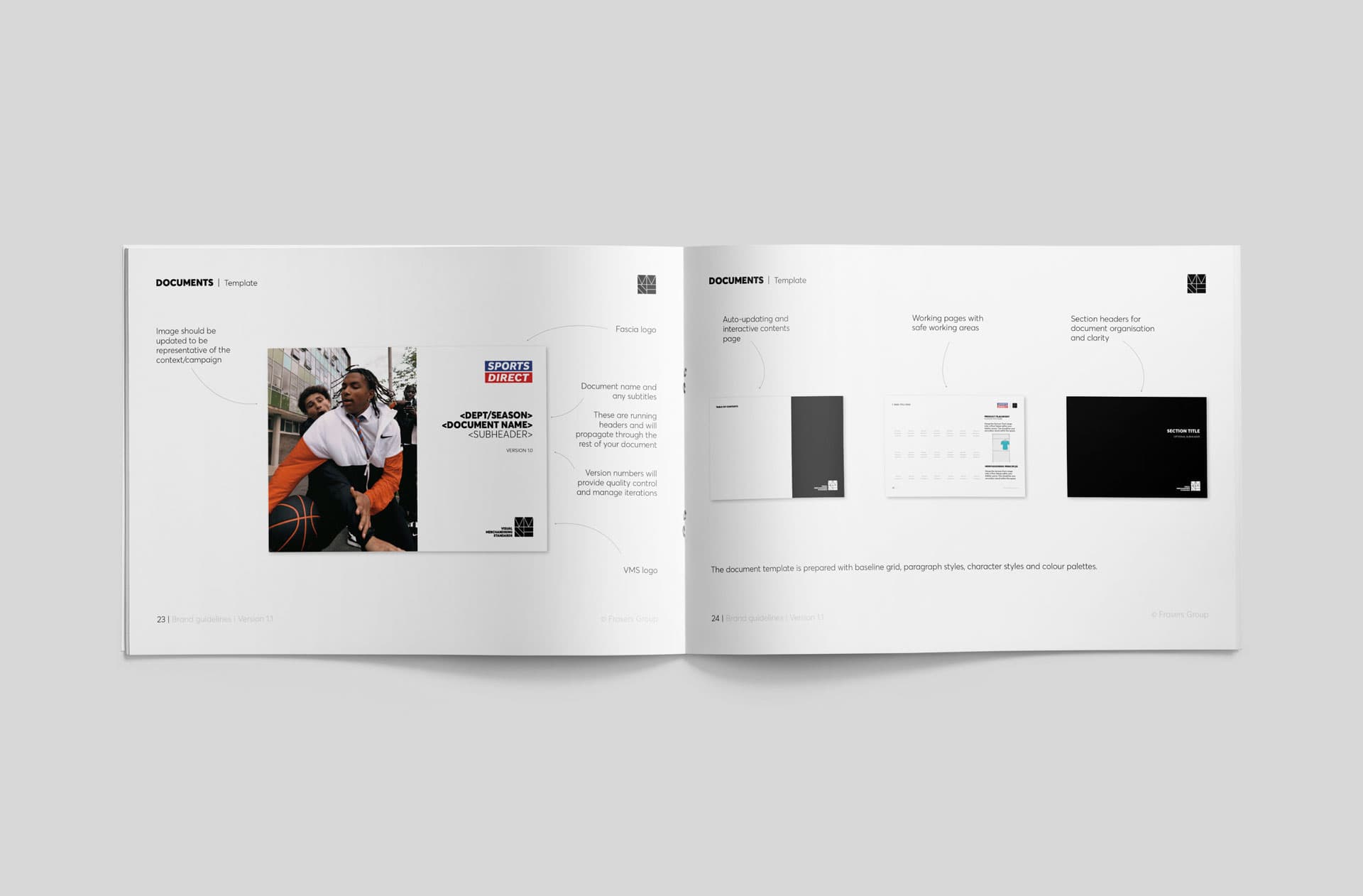
A suite of branded document templates sits at the operational heart of the system — structured for daily use by the VM team across departments and seasons. Built with baseline grids, paragraph styles and embedded colour palettes, every template ensures the same standard of presentation whether it's a seasonal brief, a product launch or a global VM rollout.