Brand identity · 2026
Nova
From scattered signals to a single line of sight.
A complete brand for an AI intelligence platform built for leisure operators — from the first research session to the final guidelines.
The brief
A new brand for a new kind of intelligence
Nova connects the systems leisure operators already run — booking, CRM, finance, staffing — and turns scattered data into clear, intelligent action. It needed a brand as clear as the product: one that earns trust in a market that has heard “AI will transform your business” too many times.
Process
Five steps, one connected line
- 1
Research questionnaires
Structured questionnaires across Nova's team to capture how each person saw the product, the market and the people it serves.
- 2
Focus sessions
Workshops that pushed the team on specific, uncomfortable questions until the essence of the brand surfaced.
- 3
Brand positioning
Purpose, audience, values, personality and ambition — distilled into clear statements the identity could be built on.
- 4
Black & white concepts
Logo routes developed in mono first, so the chosen mark works on any medium before colour is added.
- 5
Colour & system
Palette, gradient, typography, guidelines and templates — a complete system ready to roll out.
Discovery
The questions we asked
Questionnaires and focus sessions pushed the team on specific questions designed to uncover the essence of the brand. Every answer became part of the foundation.
Three problems kept coming up
Fragmented by design
Booking, CRM, finance and staffing systems rarely talk to each other, so decisions are slow, manual and error-prone.
Locked behind a specialist
Meaningful data arrives third-hand through analysts, instead of being available to the people who need it.
Reporting looks backwards
Most tools say what happened, never what to do next — so problems are tackled after they land.
The brand, in three words — from the research
How Nova feels
The mental load, quietly lifted
“I can finally stop holding all of this in my head.”
“Your next move is backed by truth rather than a hunch.”
From chasing the business to steering it.
Running a genuinely modern, serious operation.
Values
Trust, Proof, Clarity
Three commitments, three colours. The whole visual system is built to practise what it preaches.
We earn it through evidence, not promises.
Every insight grounded in source data; every recommendation traceable.
If we can't show it worked, we haven't finished.
The finish line is a measurable result, not a shipped feature.
If it doesn't make the decision simpler, it doesn't belong.
No jargon, no hedging, no burying the answer.
Logo concept
Scattered signals, drawn into one shape
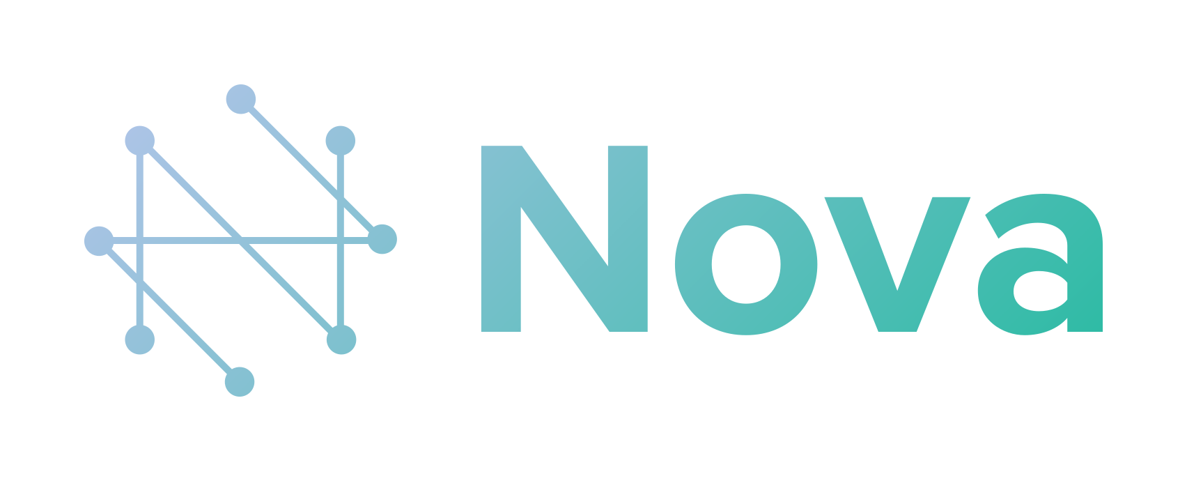
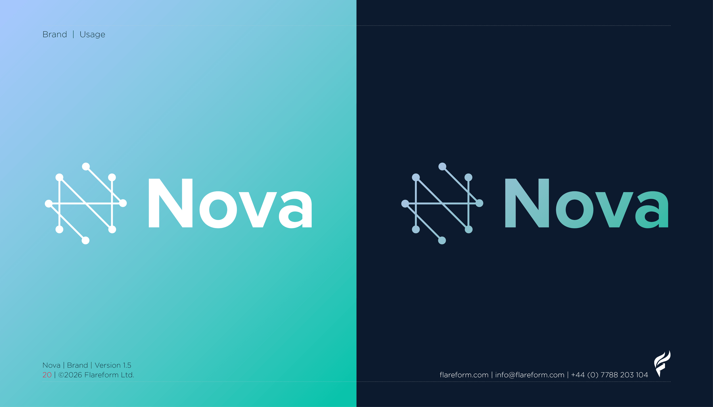
The N is built from Nova’s own data points — scattered signals pulled together into one legible mark. It’s a literal picture of what Nova does: bringing fragmented systems into a single line of sight.
Development
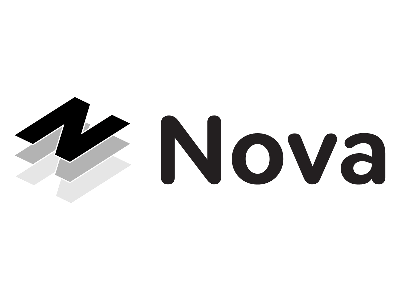
Every mark starts in black and white
Concepts were developed in mono first, so the chosen mark would hold up on any medium — print, screen, signage, a 16-pixel favicon — before colour was introduced.
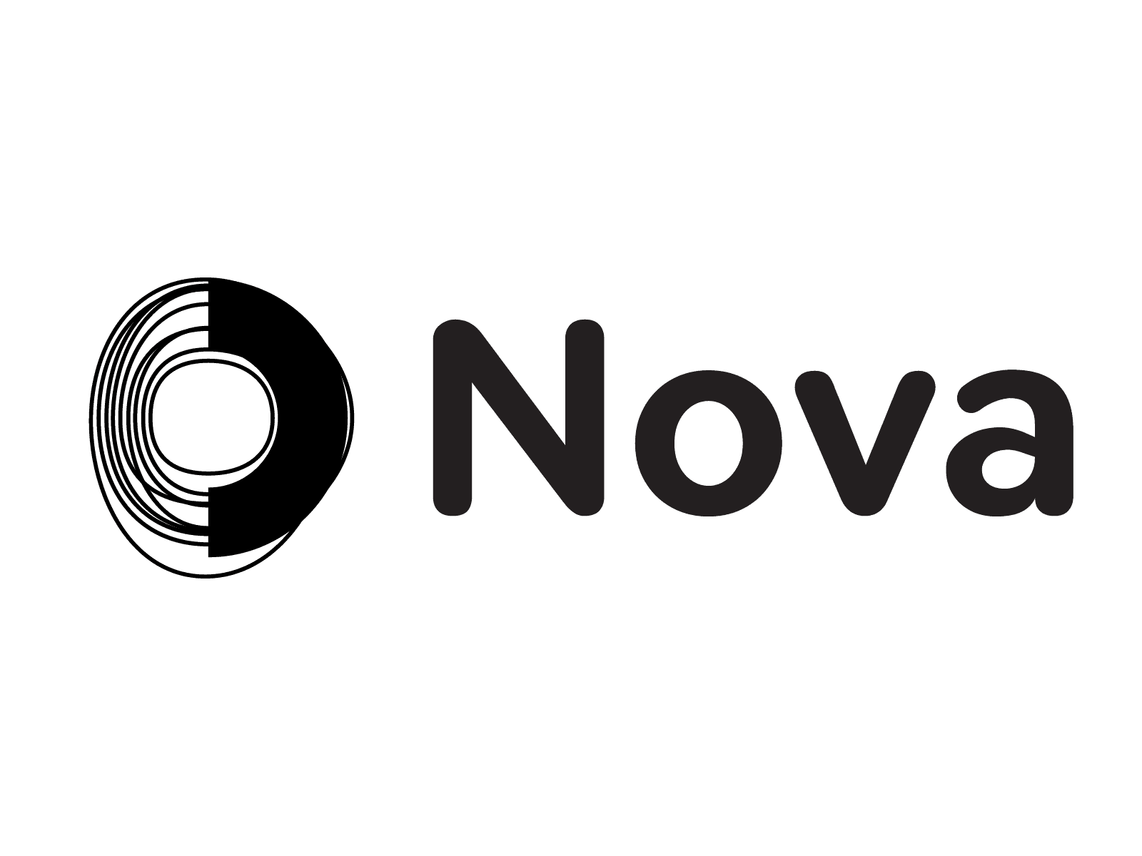
The final mark — then colour

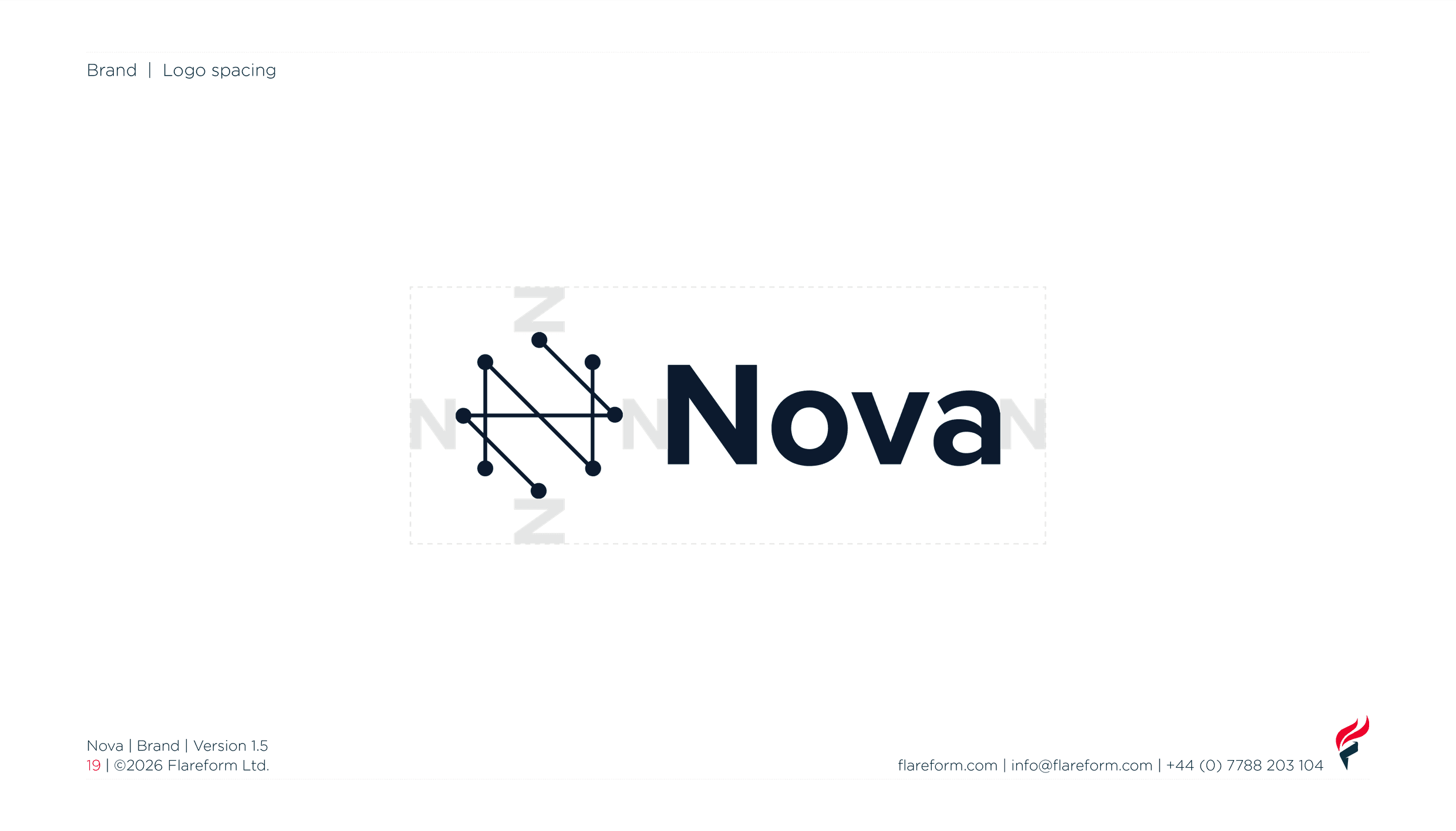
Clear space
Room to breathe
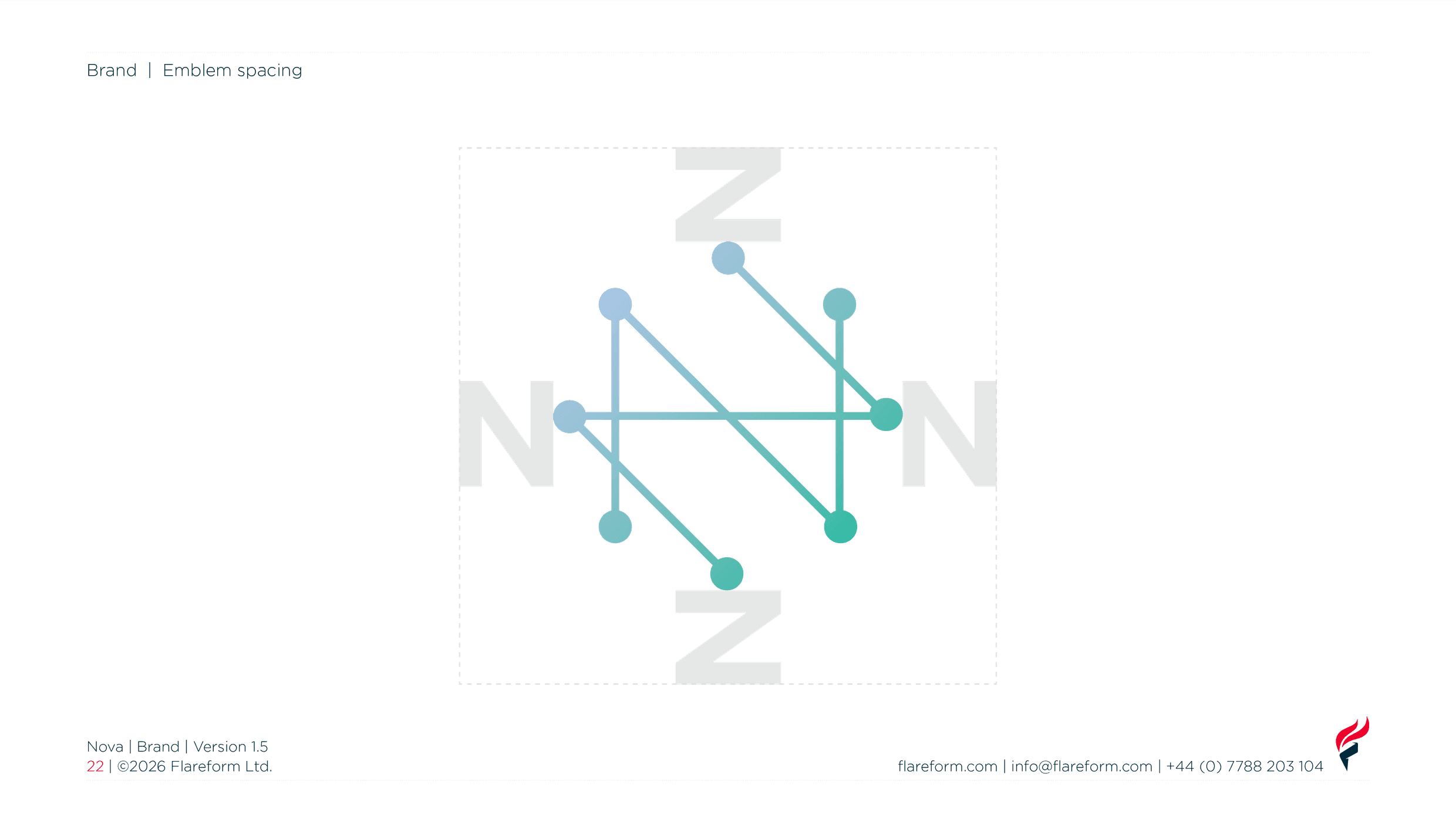
The N sets the clear space around both the logo and the emblem, keeping the mark legible wherever it appears.
Colour
A palette that maps to the values
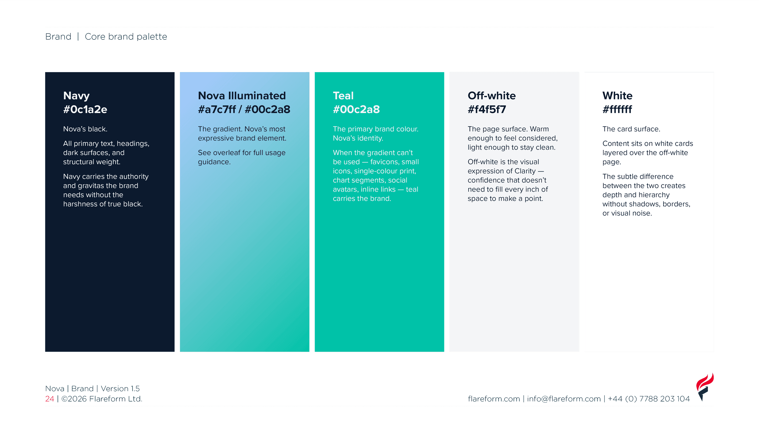
Trust is carried by the navy and the blue end of the gradient. Proof by the teal. Clarity by what isn’t there — the off-white, the white, the space.
Navy tints
Teal tints
Nova Illuminated
Intelligence made visible
The shift from periwinkle blue to luminous teal mirrors what Nova does: moving from complexity toward clarity. The 45-degree angle creates forward motion.
A signal, not decoration — the gradient earns its power by being withheld.
Typography
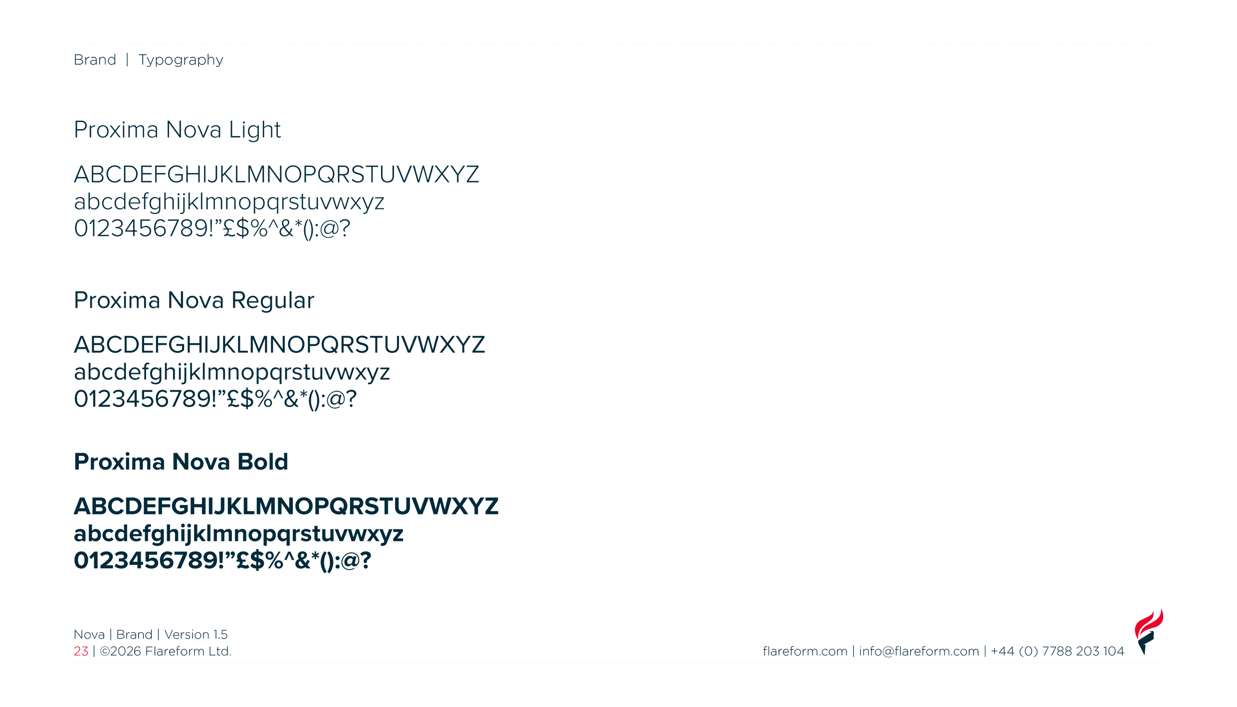
Proxima Nova
Light, Regular and Bold — a geometric sans that stays calm and precise at every size.
Brand guidelines
One guide, the whole brand
Positioning, values, logo, colour, typography and assets brought together in a single set of guidelines — so Nova stays consistent wherever it goes.
From the first question to the final guideline — a brand that does what Nova does: turns complexity into clarity.